Inspiring educator website case studies
A few weeks ago, in our article "New strategies emerging for educator websites" we introduced several important strategies - liberalised page scrolling and responsive design, in particular - that are helping to shape some of the best websites in education today. We promised in that post to take a closer look at specific case studies of successful education sites, and in today's feature we are pleased to share some profiles of outstanding sites from Canada and the US. First up is the redesigned Notre Dame website. To say the least, this is a redesign that has generated a great deal of interest within the post-secondary web development community, particularly in the US. With this latest iteration of its website, the Notre Dame web team has left behind a number of long-standing design conventions to present a bold new idea of what a university site can be.
Scroll, scroll... keep scrolling
One particular point to highlight here is the desktop version of the homepage (as is the case for other major landing pages on the site) is massive – like megabytes-massive. Notre Dame has super-sized the conventional feature carousel found on many college sites and created an incredibly lush feature space at the top of the page with a number of inset, interactive elements that incorporate news and other feature content, photo galleries, and campus tour components. There are a couple of important ideas at work here. First, Notre Dame wanted to reflect its community in this rich feature space and, second, it also wanted to convey the experience of the Notre Dame community – and the campus around which it is centred – to new or prospective students. Beyond these feature elements, the homepage contains a huge amount of content. On most other sites, this much information would be broken down into multiple, separate pages. At Notre Dame, the voluminous homepage is mainly accessed by scrolling (and more scrolling) but there are some clever internal navigation elements on the page as well that help users move from section to section.
Responsive design
Another stand-out aspect is that the large size of the homepage (and other major landing pages) is mitigated for mobile users by Notre Dame's thoughtful application of responsive design. The site automatically adjusts for tablet and smartphone browsers by smoothly adapting page structures and even by removing some of the heavier items on the page for smaller mobile browsers. To see this in action, visit the Notre Dame site from both your desktop and mobile devices, or even simply resize your desktop browser window manually. There are many other examples of good responsive design implementations as well as innovative redesign efforts across the education sector. For an interesting sampling of these, please see the just-announced eduStyle Higher-Ed Award Winners for 2012.
Social engagement
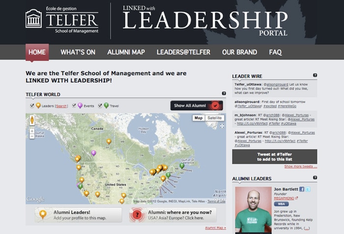
Given the current emphasis on social media in education marketing, we could not resist highlighting another great case study that presents an innovative approach to social engagement in education.
The University of Ottawa's Tefler School of Management has made great use of the powerful (and free!) Google Map APIs to create an interactive map feature on its website.


